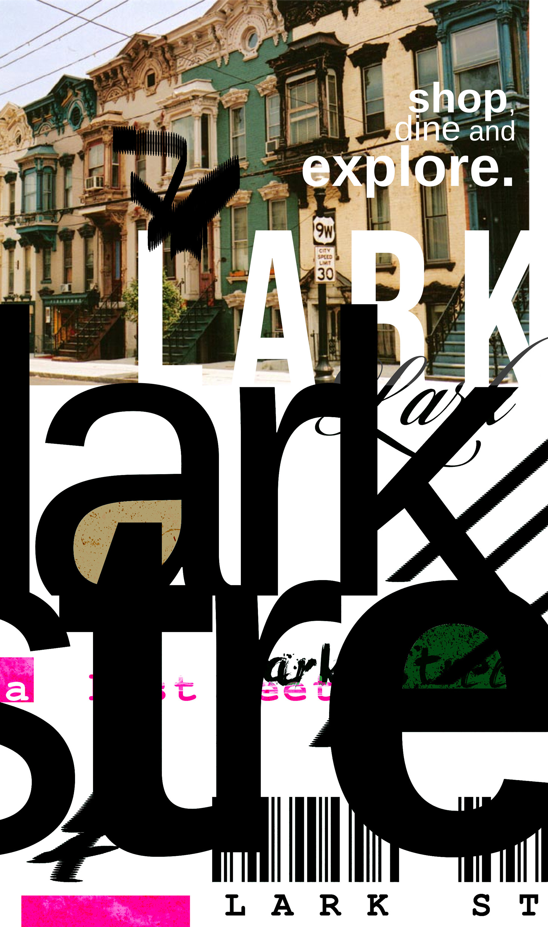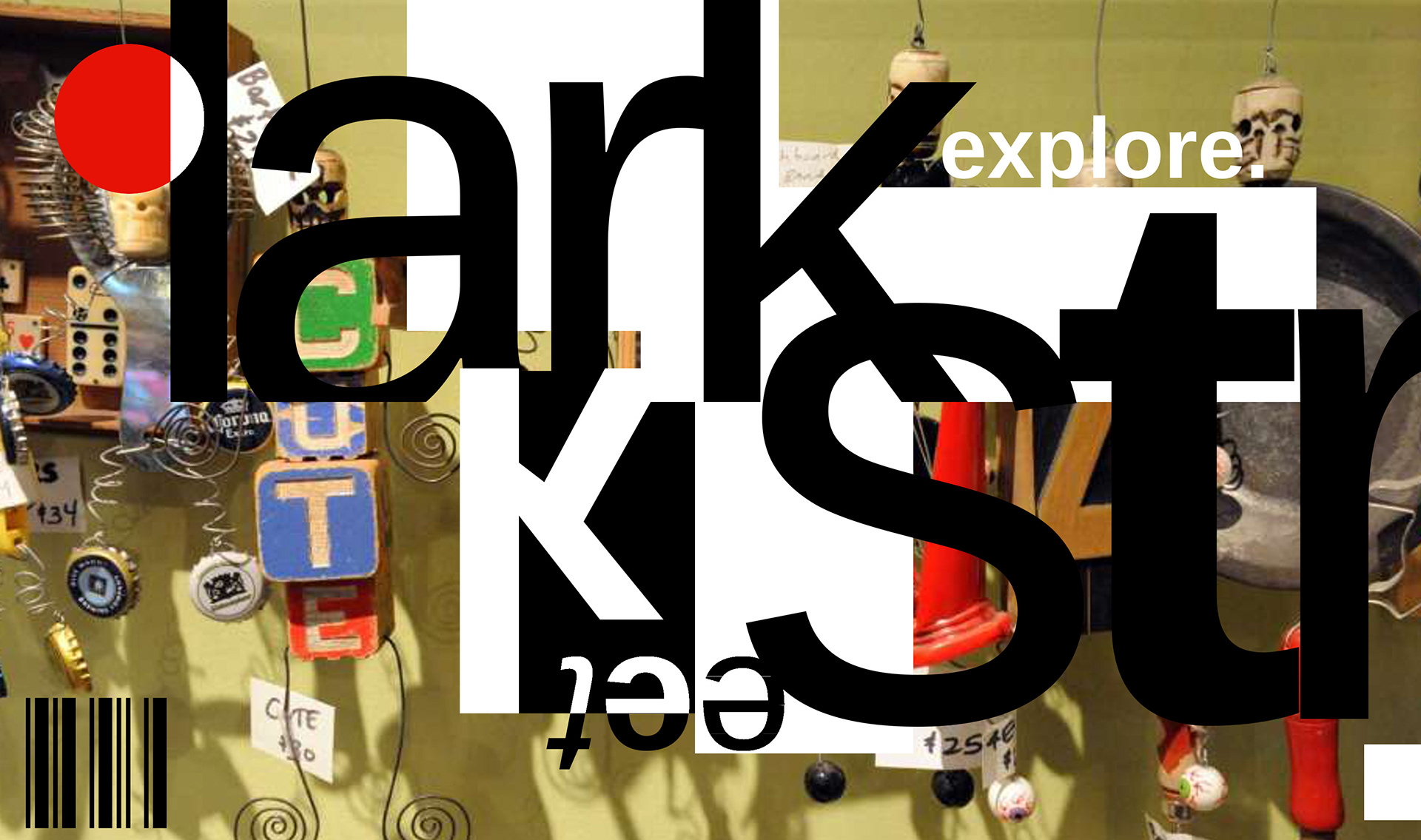
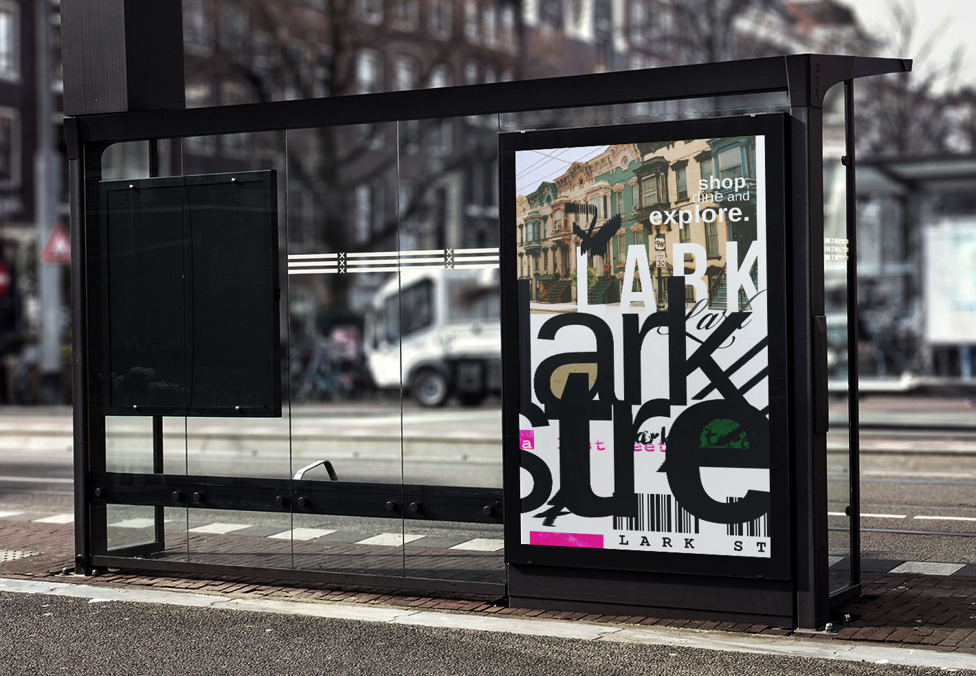
This speculative promotional project explores Lark Street as a typographic landscape. Instead of building a traditional logo system, I treated the district itself as the identity—using oversized type, layered imagery, and post-digital graphic markers to create a campaign that feels as dense and chaotic as the street.
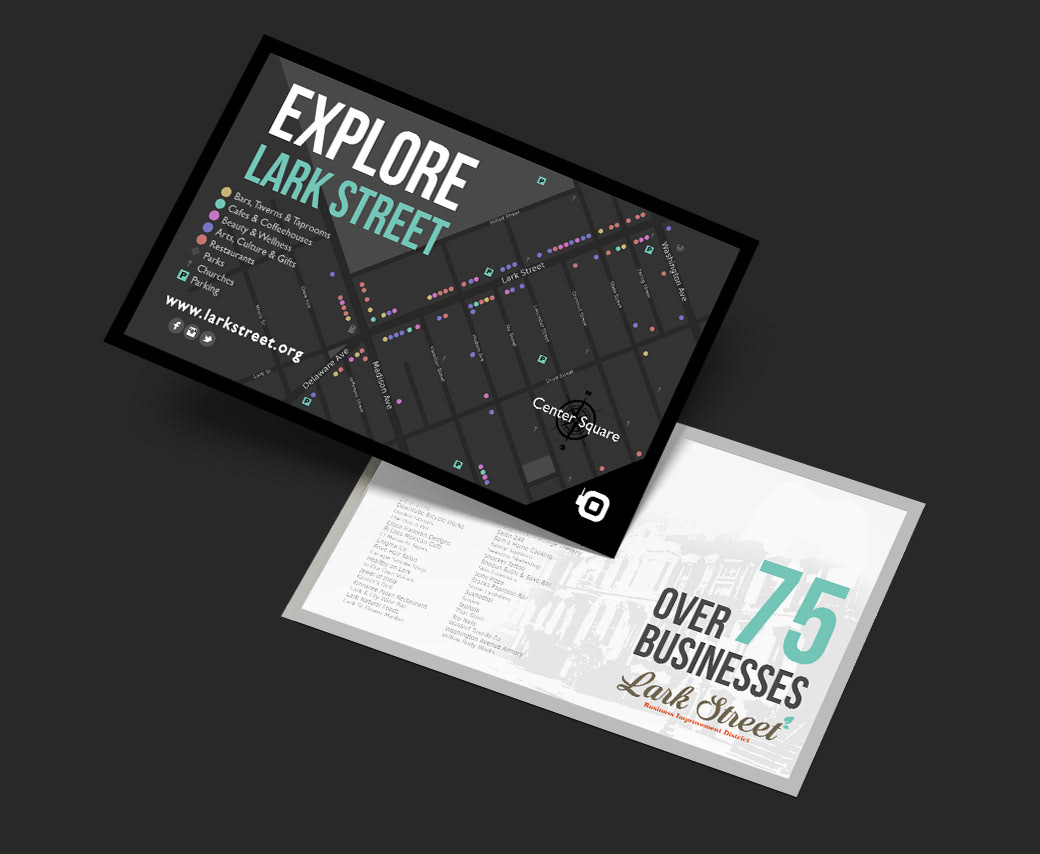
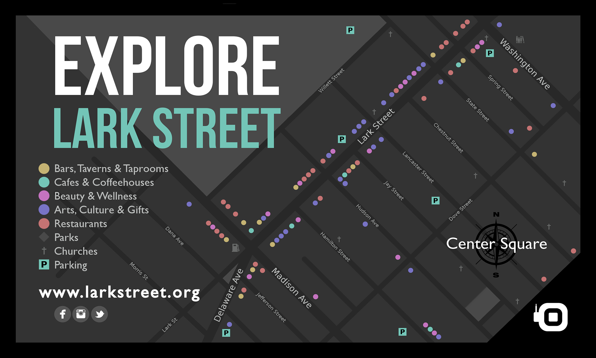
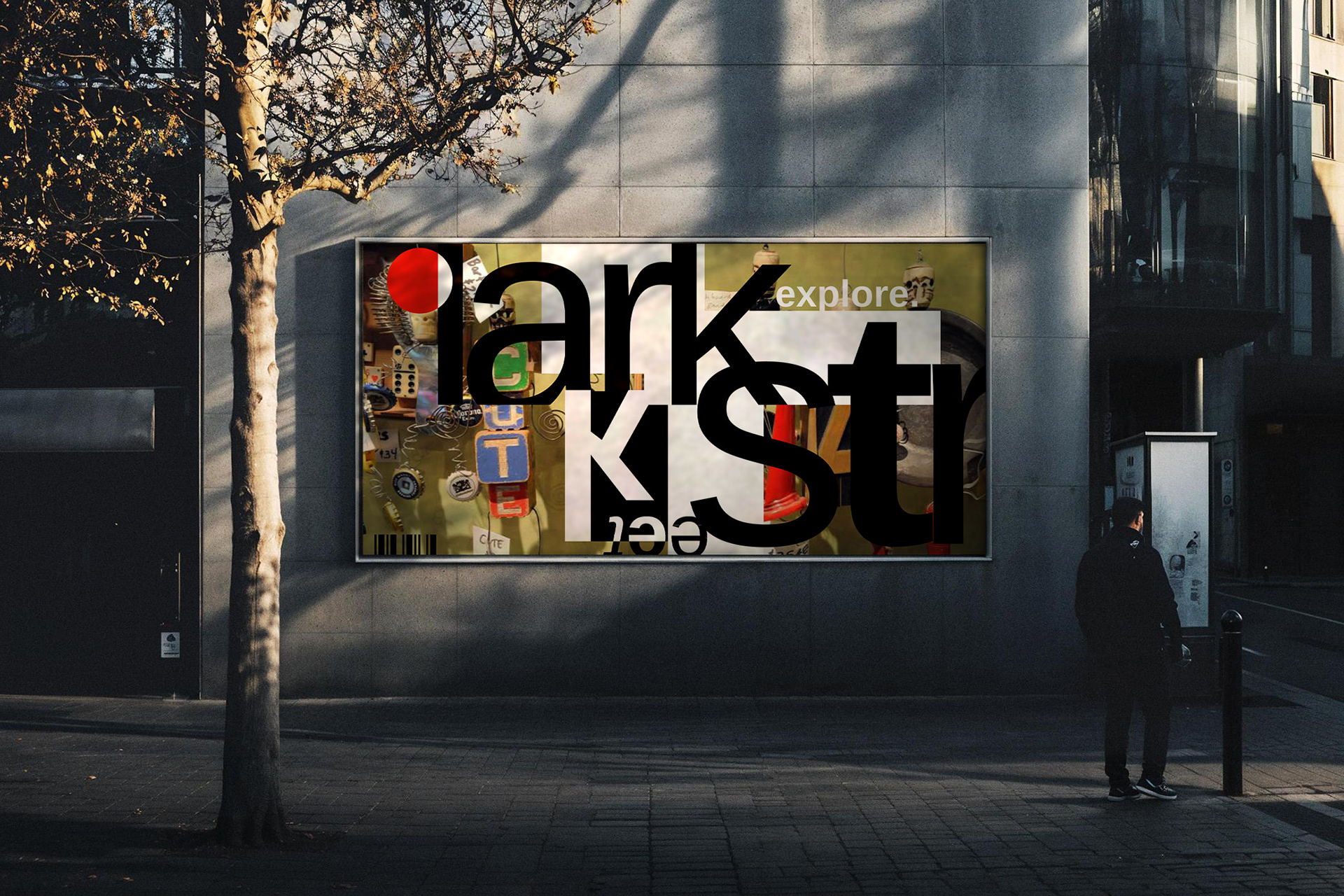
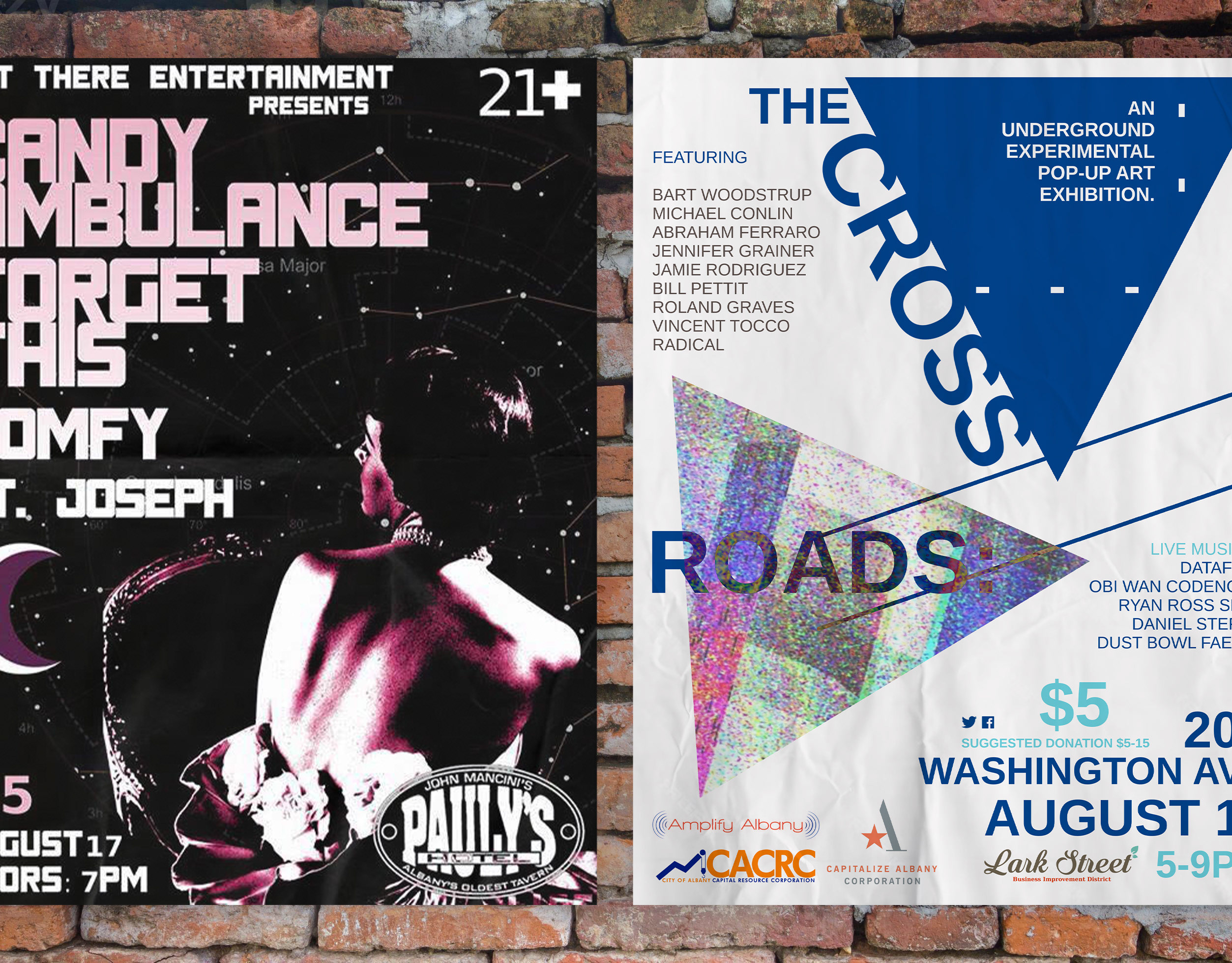
The campaign imagines type as signage, texture, and wayfinding—something you move through, not just read. Designed for public-facing placements like bus shelters and street posters, this direction treats the district as a living editorial spread.