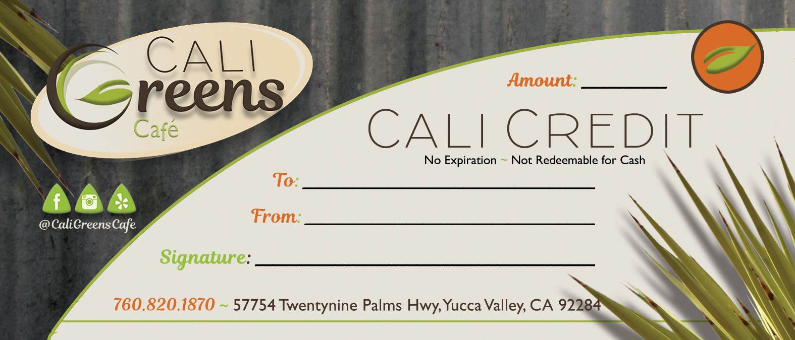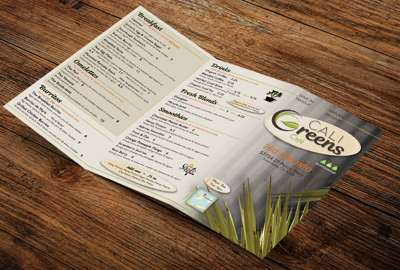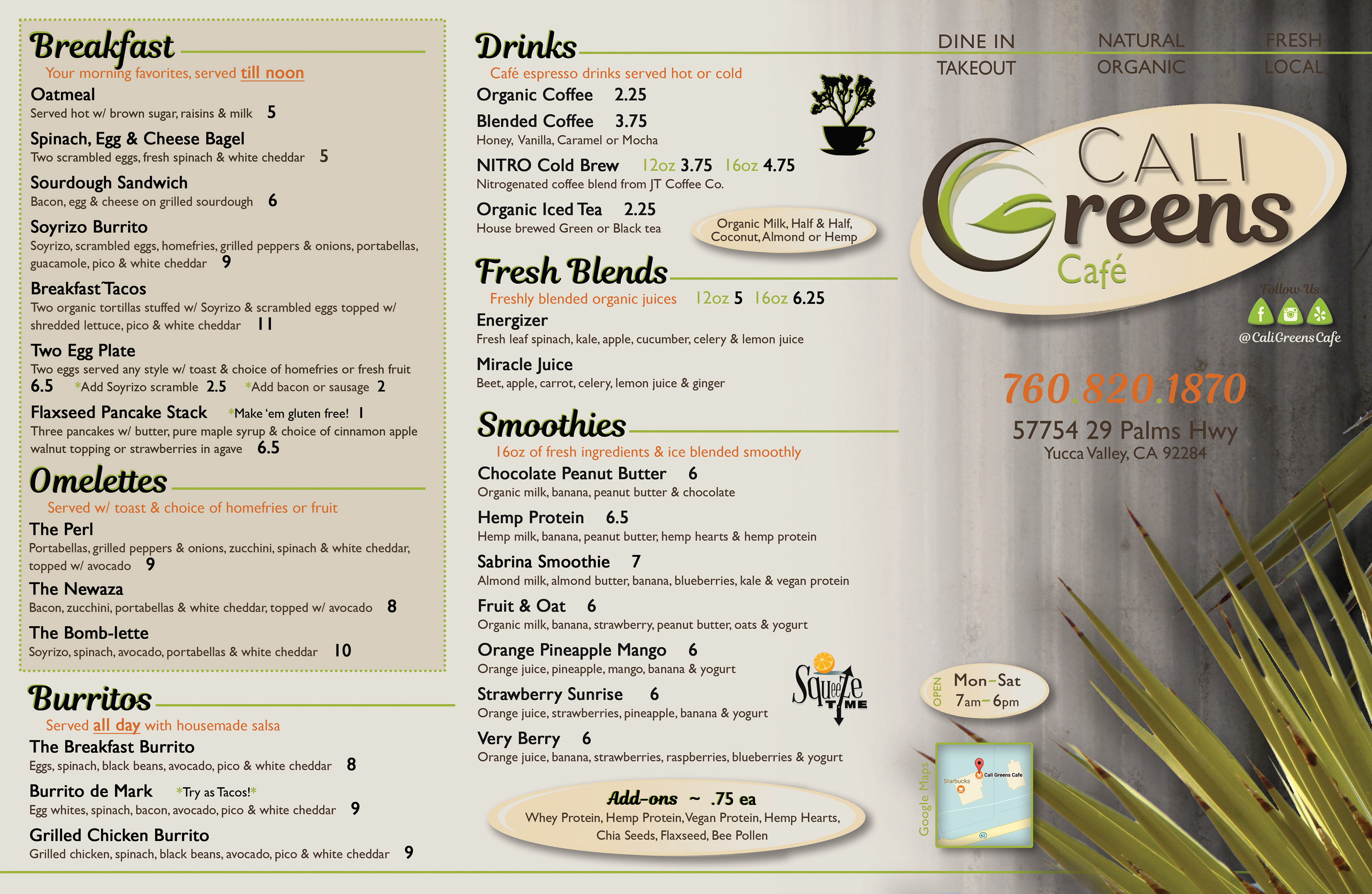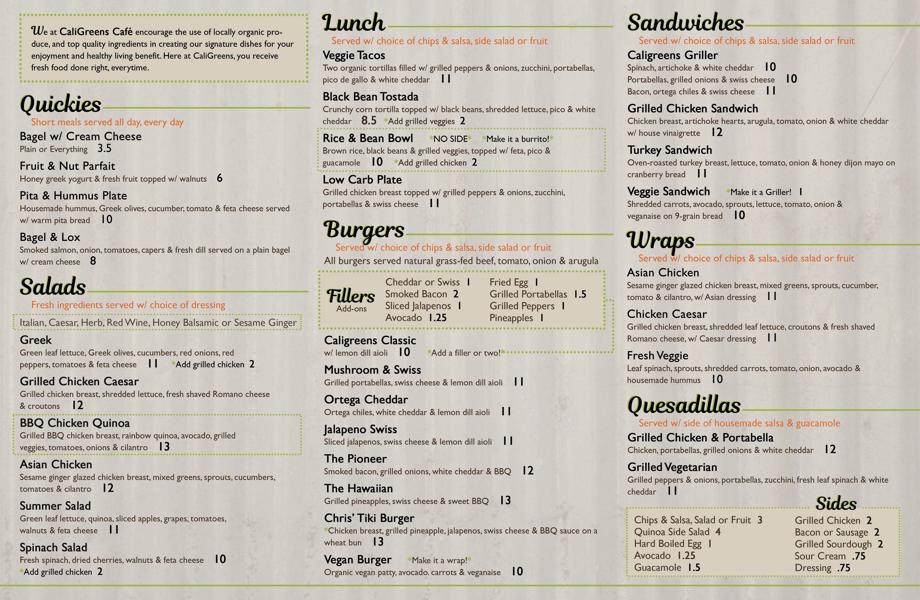
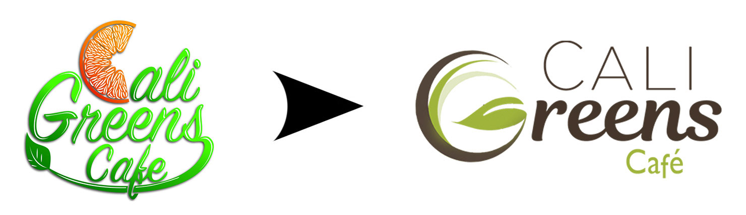
This was a long-overdue identity refresh for a high-volume café with real operational constraints. The work focused on a pragmatic rebrand and menu system designed to live in tight spaces, handle dense information, and support a hands-on owner-operator—creating clarity and calm with a cleaner, more contemporary system built for scalability, organization, and daily use.
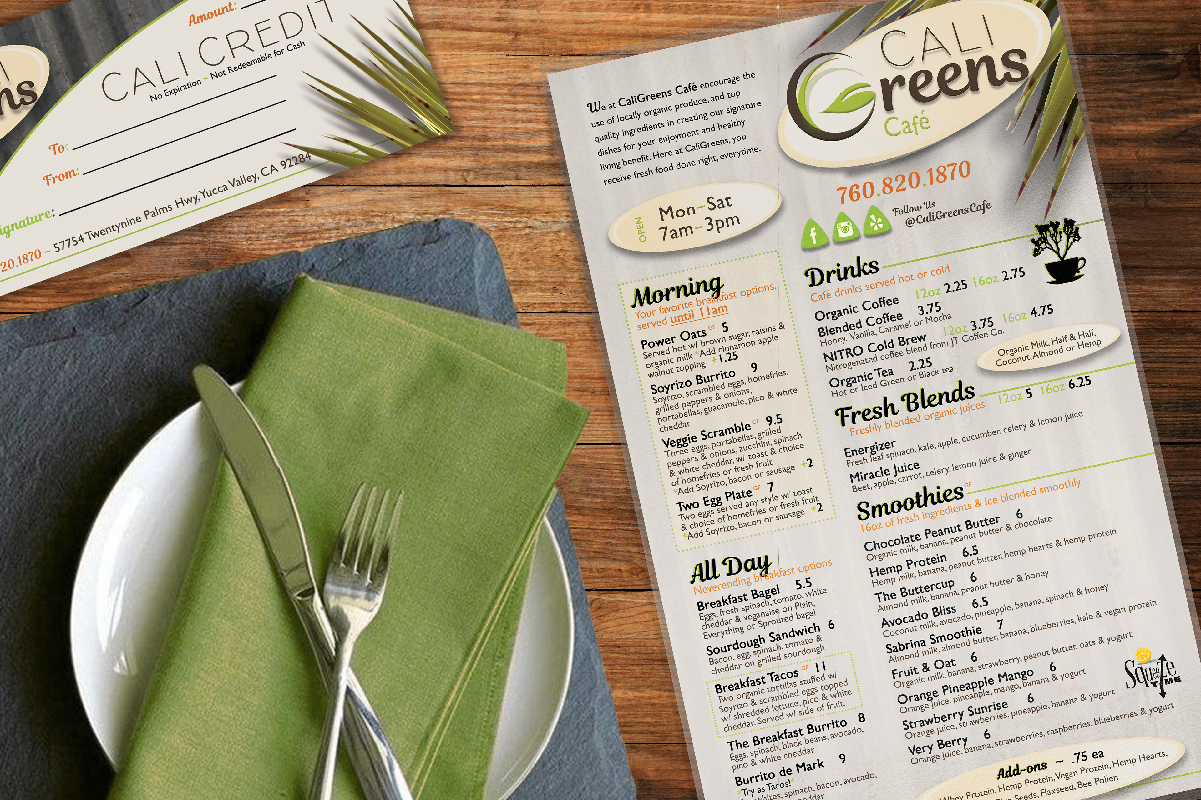
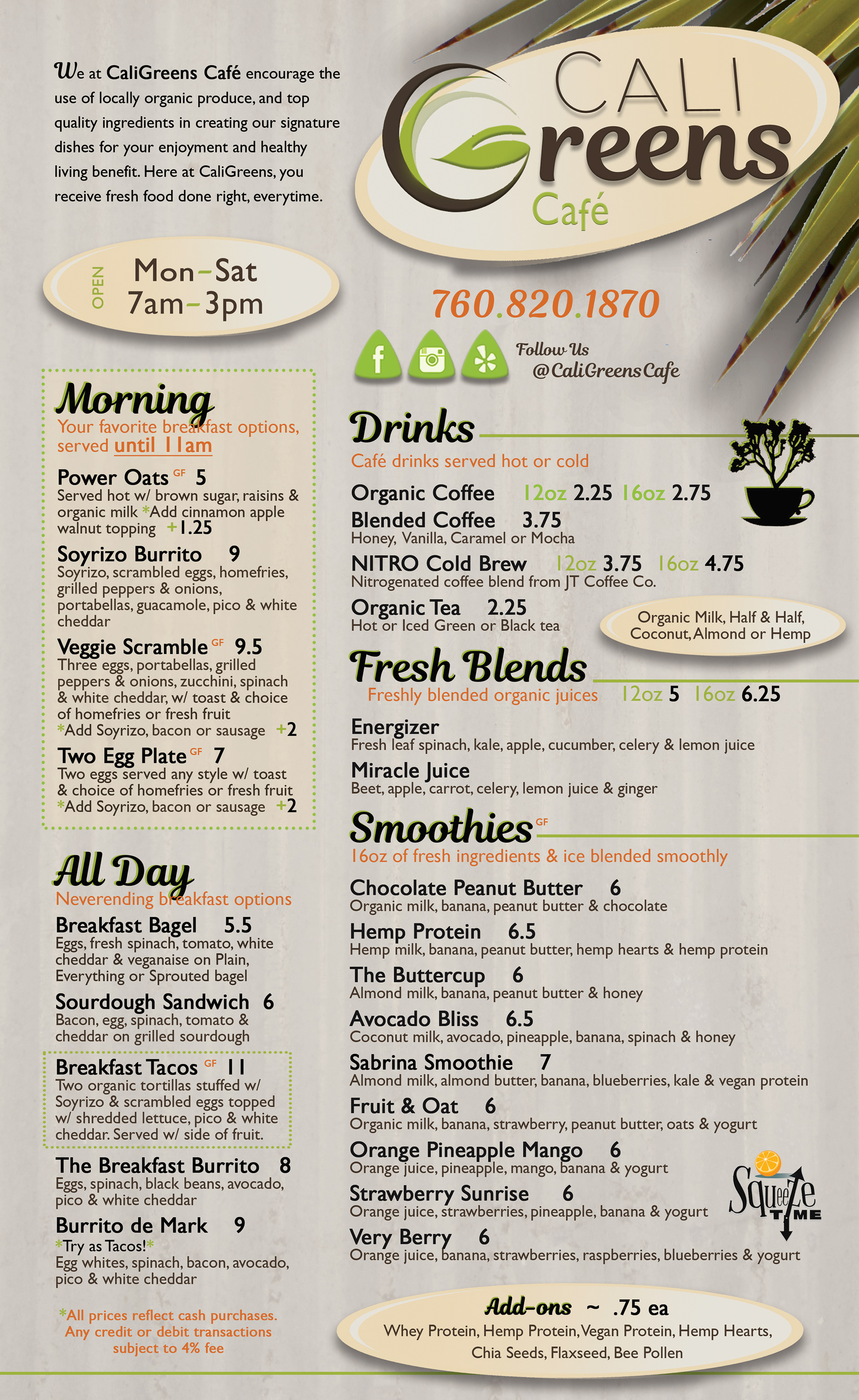
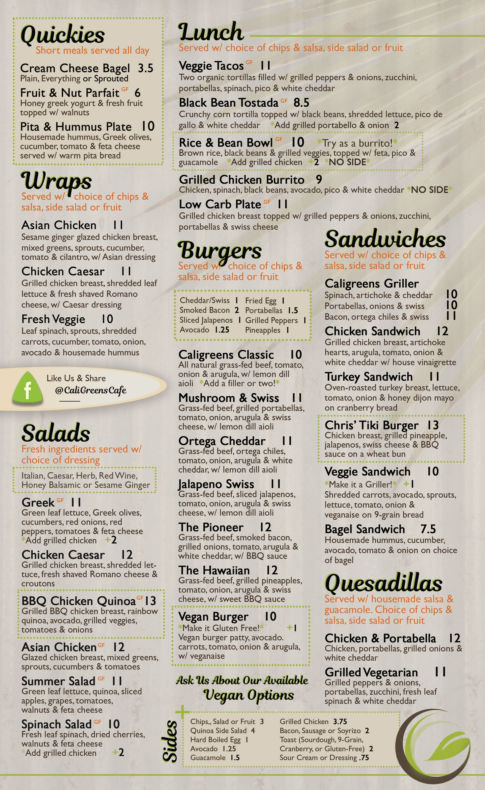
I rebuilt the logo and menu system to prioritize legibility and flow while still grounding the identity in desert cues (agave, muted greens, earthy neutrals). The layouts treat menus and collateral as modular systems that could scale across print and in-store use, even with content-heavy requirements.